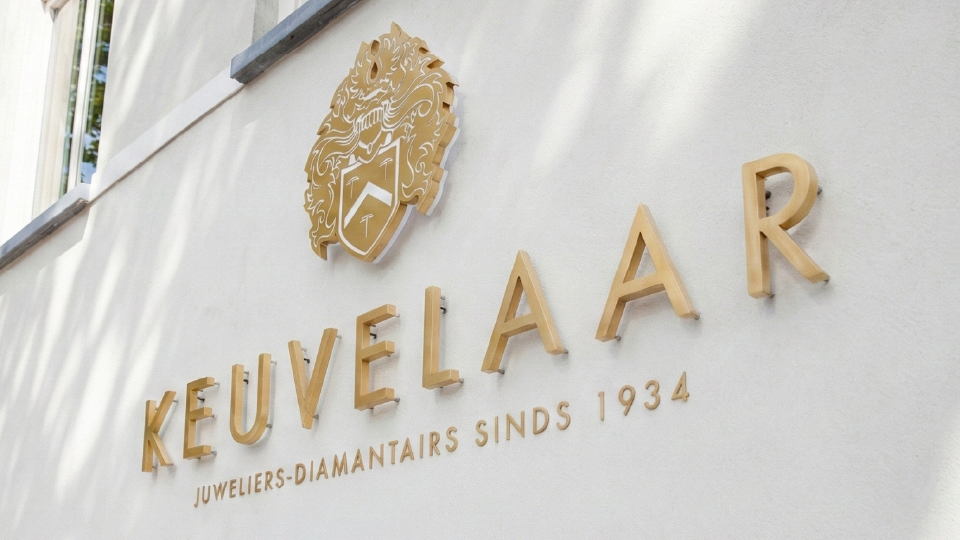
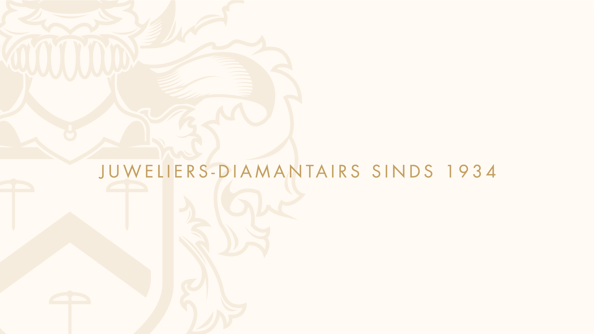
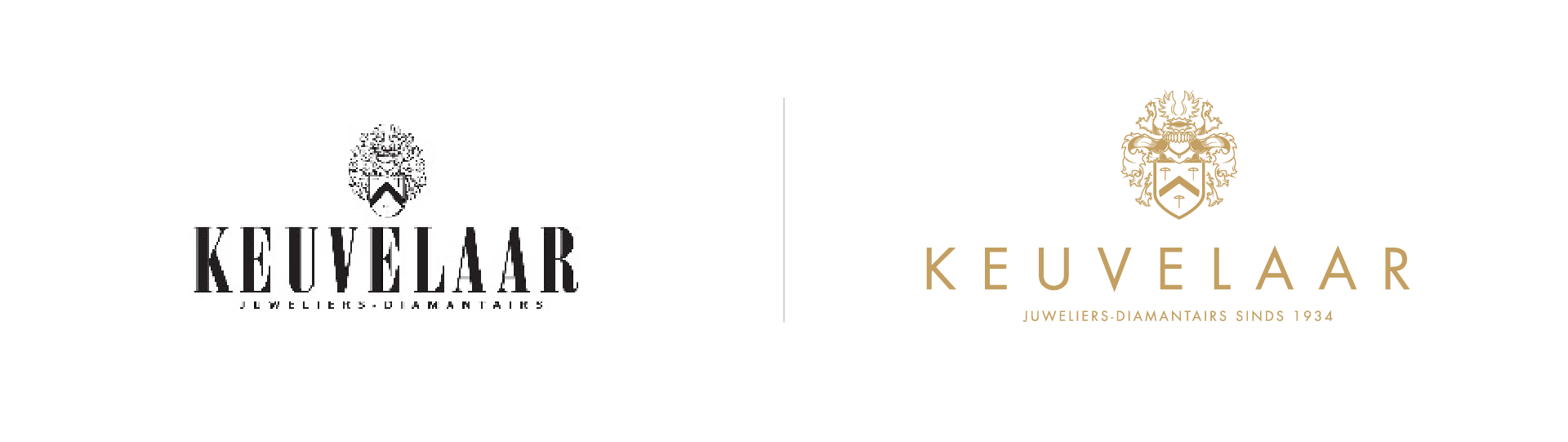
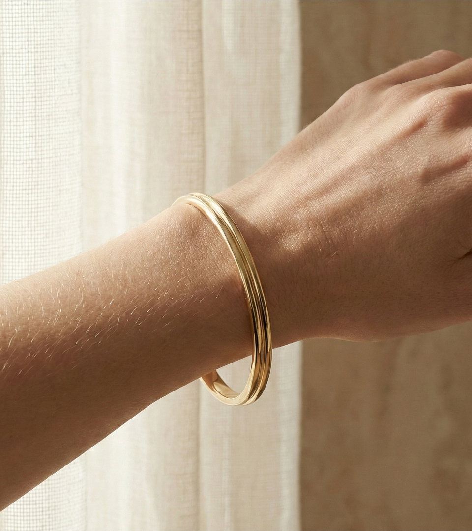
Since 1934, Keuvelaar has stood as a pillar of luxury in the Netherlands, offering high-end jewelry and timepieces with a reputation built on generations of trust. However, their visual identity needed to evolve to reflect a contemporary definition of prestige.
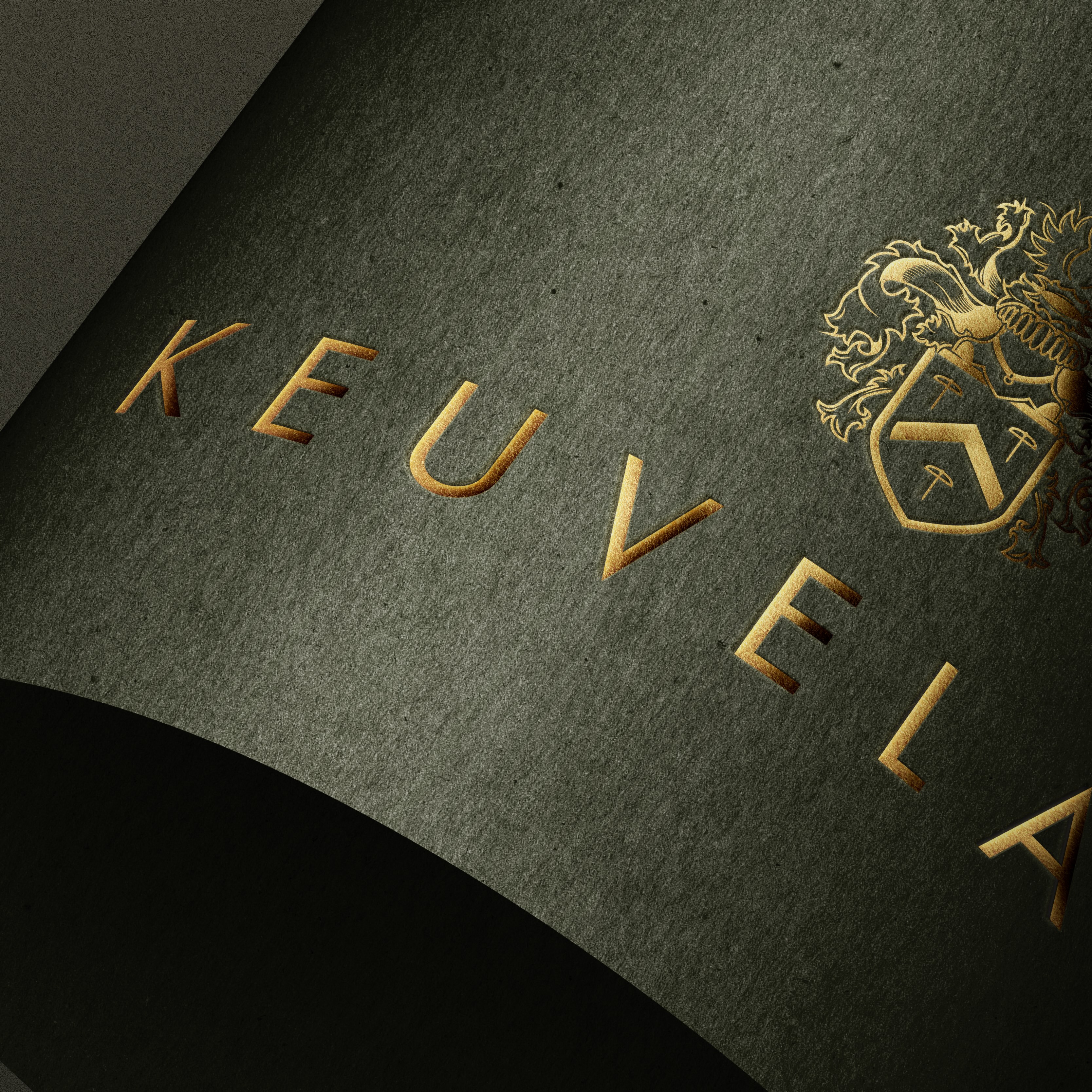
Polishing a Gem from 1934, bridging the gap between a 90-year heritage and modern luxury. For Keuvelaar, a historic Dutch jeweler, we approached the rebrand by meticulously re-illustrating the family crest. By refining the original elements into a cleaner, more graphical form,
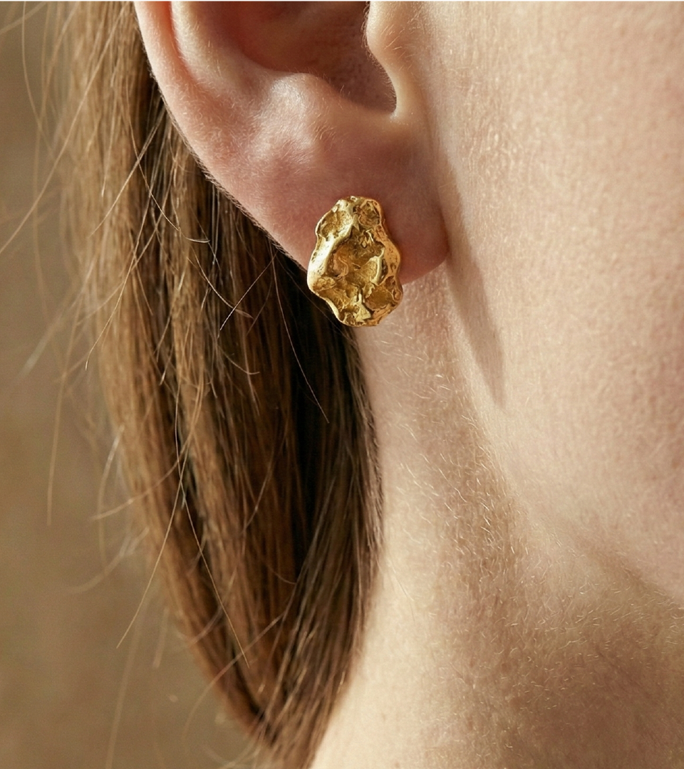
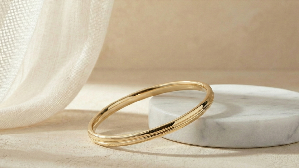
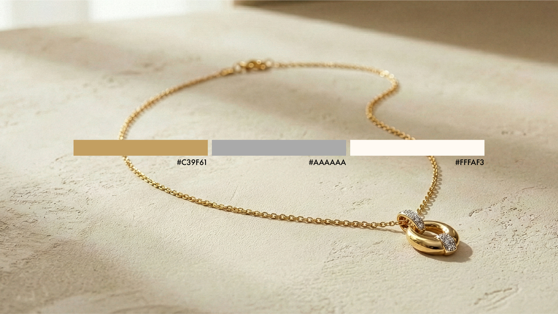
For the wordmark's typography, we selected Futura, a geometric sans serif that balances boldness and luxury with approachability, signaling a trustworthy and fashion-forward future. The identity was finished with a sophisticated copper-gold palette, a choice that instantly communicates warmth, luxury, and timeless value.