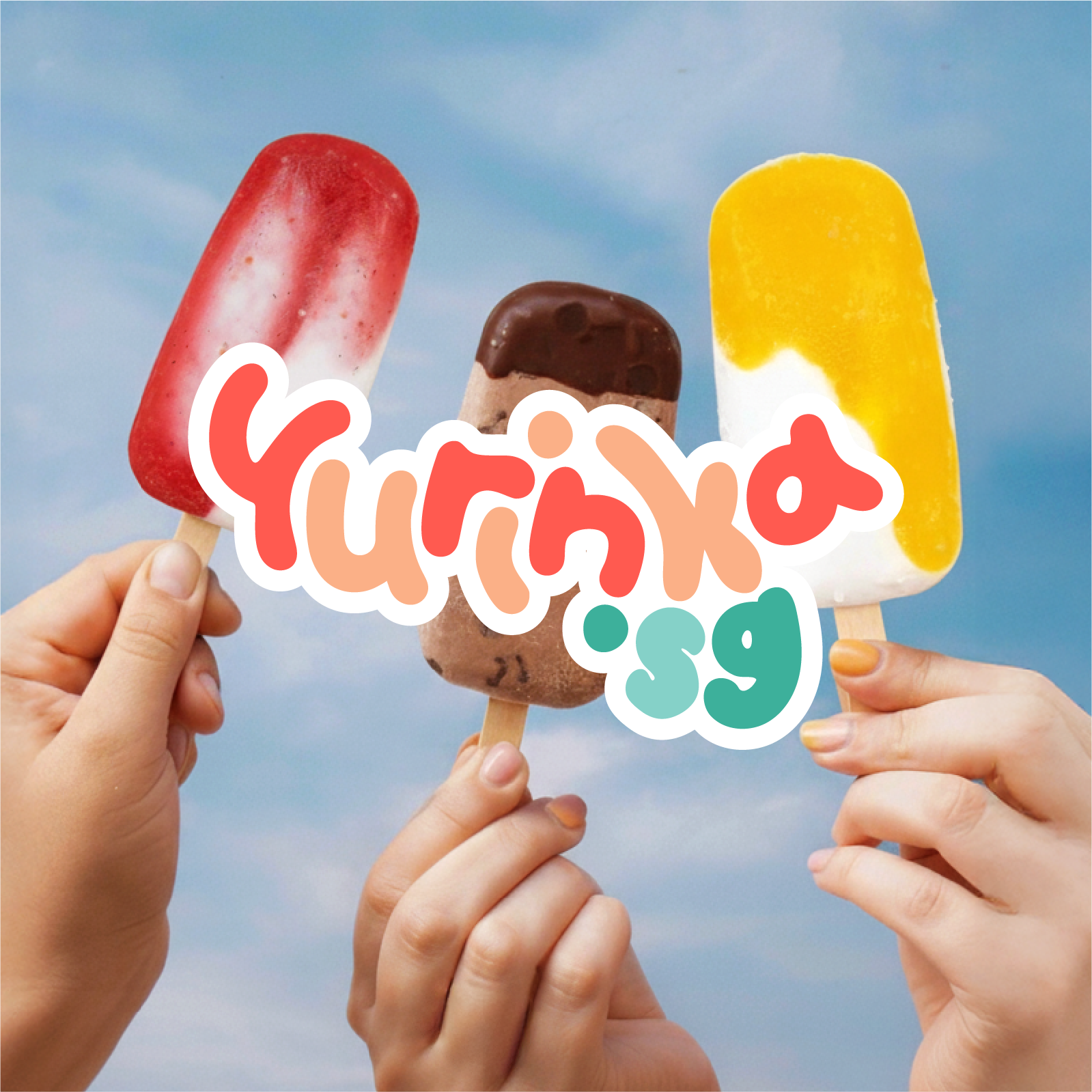
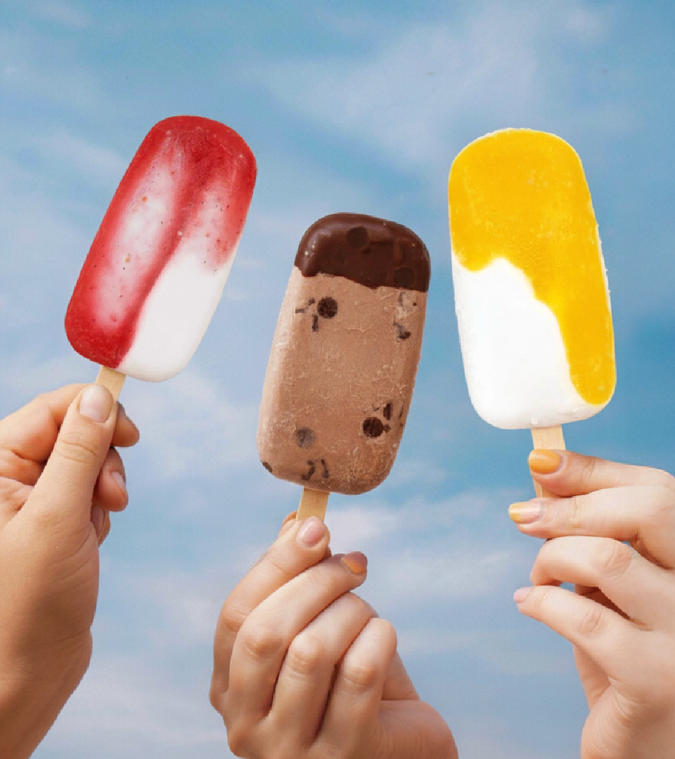
Yurinka needed a brand identity that tasted as good as its products. Moving from a home-based kitchen to the bustle of pop-up markets, the brand required a visual system that was impossible to ignore.
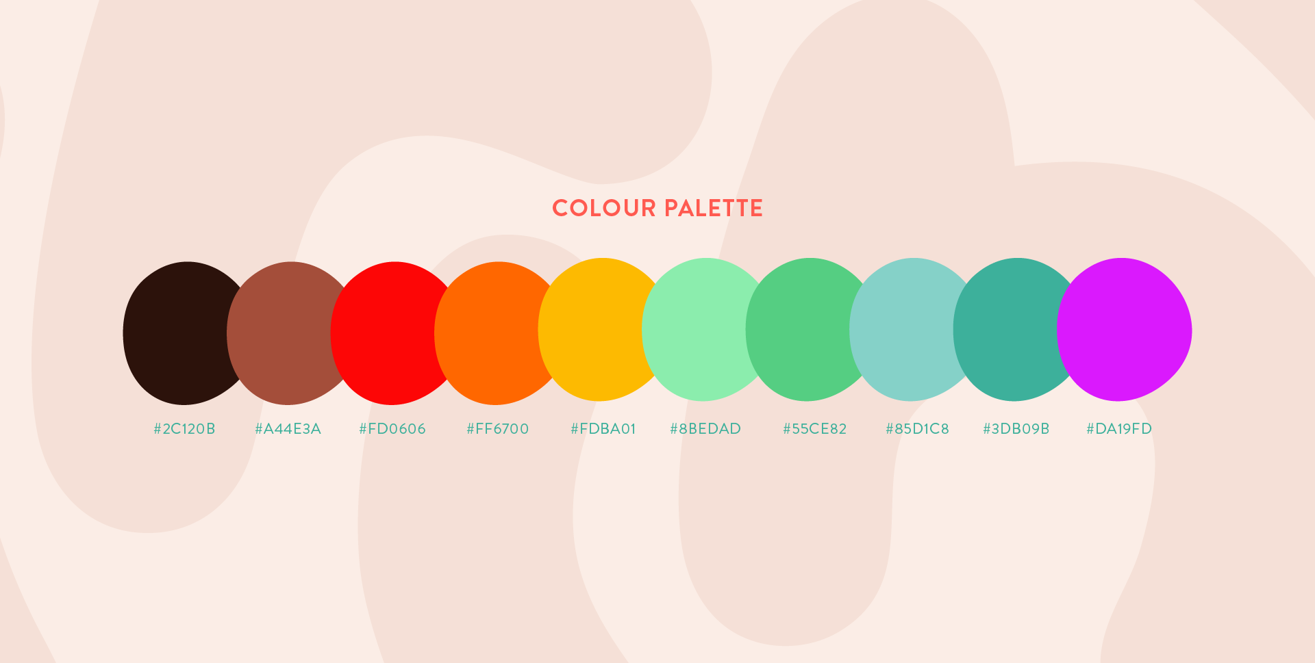
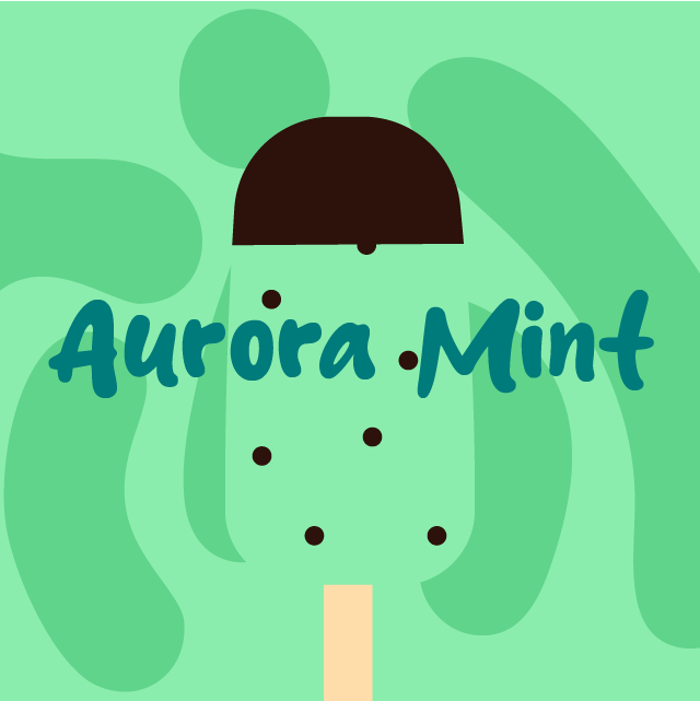
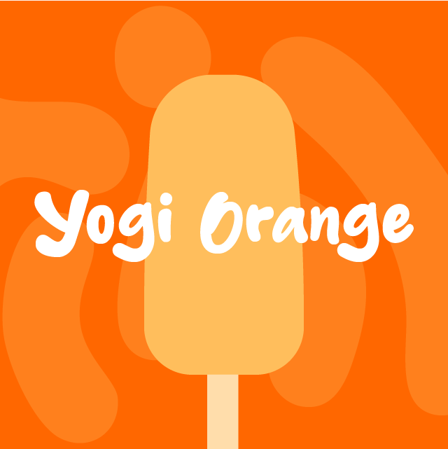
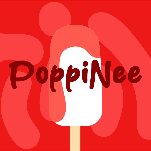
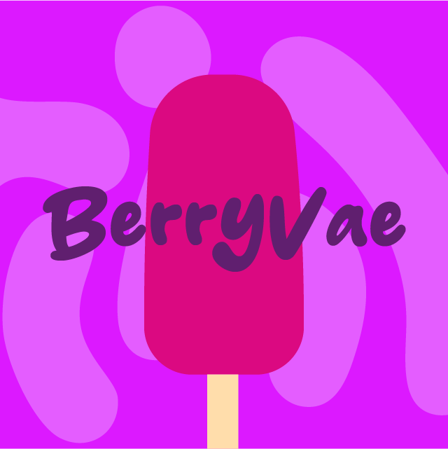
Our solution was a "flavor-first" identity system. We developed a suite of vibrant, fruit-inspired colors and a custom pattern system that mimics the melting, fluid nature of fresh popsicles.

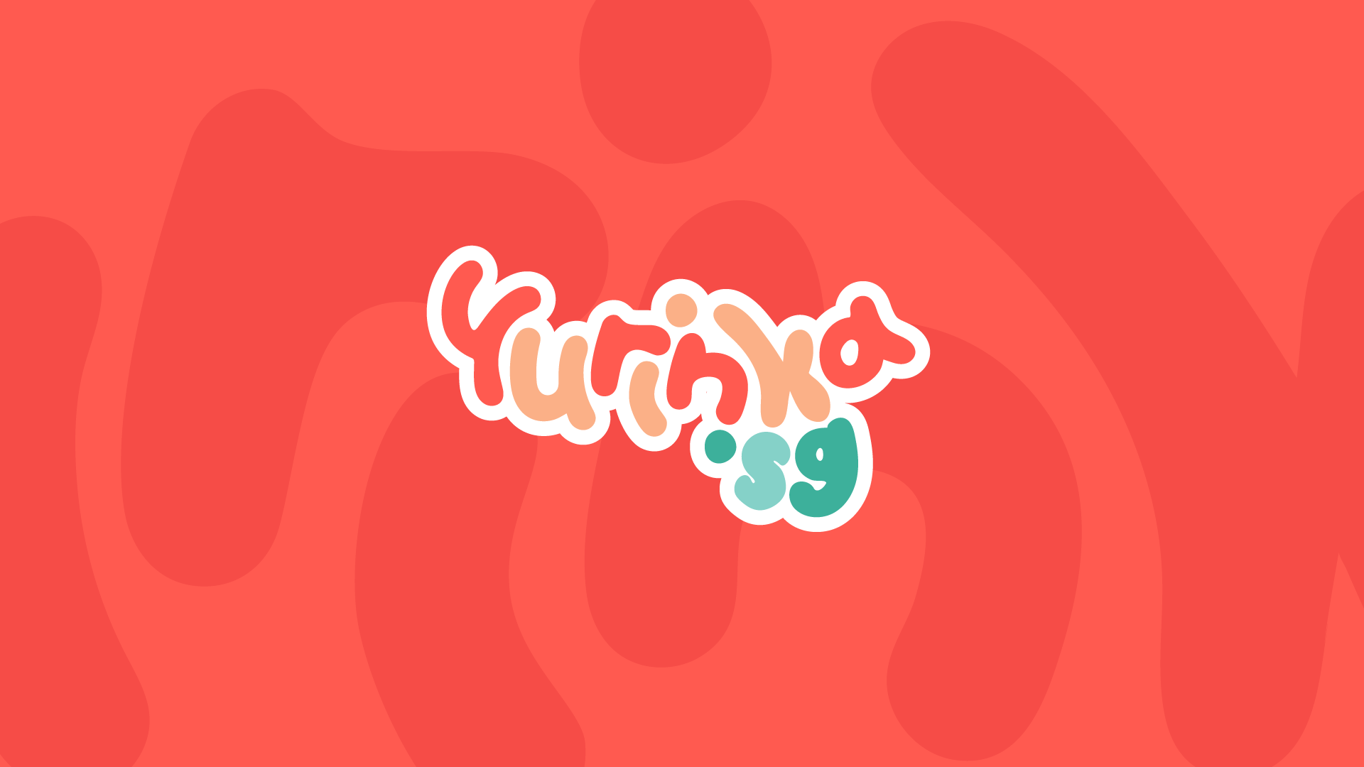
The centerpiece is the new logotype: designed with a "puffy," organic weight and a staggered baseline, it captures the bouncy, excitement-filled feeling of the brand.


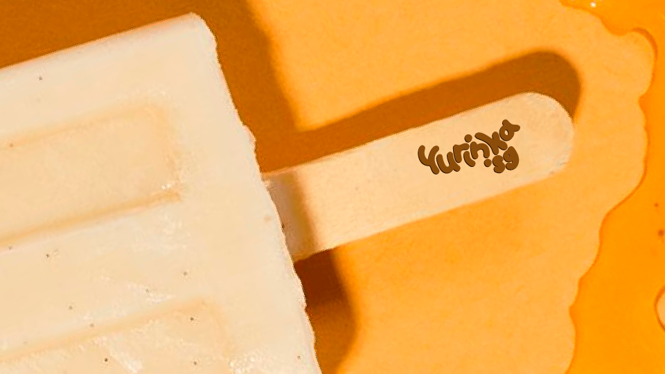
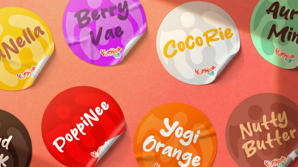
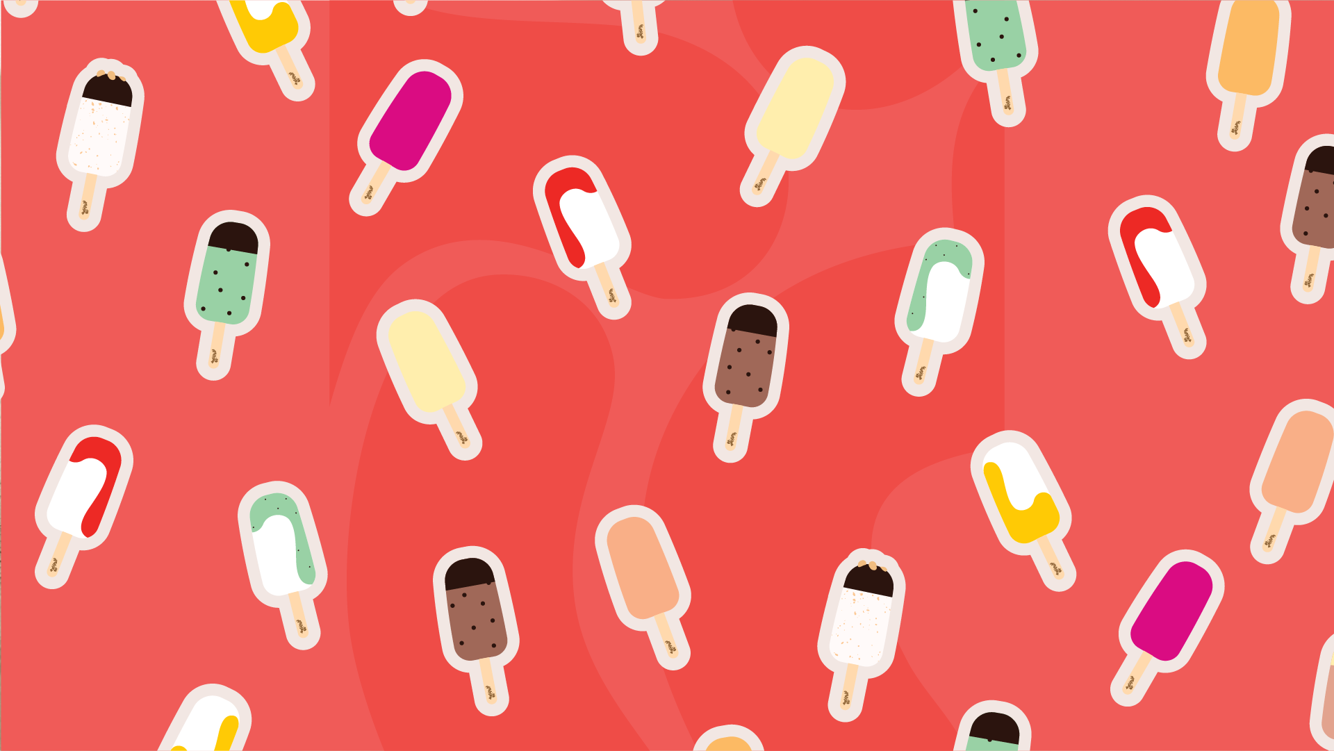
This tactile approach extends to the packaging, where custom flavour stickers serve as quality seals, reinforcing the handmade, artisanal nature of every stick.